Over the years of its existence, Foliovision has completed dozens of successful projects. One of the recently conducted remarkable cooperations is certainly the project with USNSTPA, the US Men’s National Soccer Team Players Association. The members of the labour union for soccer players own a website containing fresh soccer news, called US Soccer Players.
While USsoccerplayers.com has been very busy – frequently updated and just as frequently visited, it was not functioning as well as it could have. Its owners concluded that a transformation was necessary in order to make their job easier, and to improve the experience of everyone eager to read what is new in the world of soccer. It was the high time to leave TypePad and migrate to a custom WordPress site. However, moving 6900 posts, 350 pages and 4500 comments is extremely tough and time-consuming for someone with no professional experience, and that is why Foliovision was asked to step in.

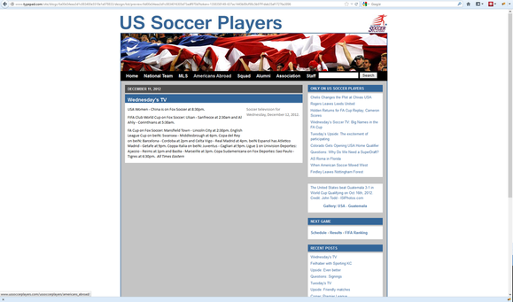
US Soccer Players Before the Change
USNSTPA was not Foliovision’s first contact with a soccer website, quite the contrary. The company has worked on a similar website in the past, Fox News on-air soccer personality Ives Galarcep’s site Soccer By Ives. After seeing Ives’s new site and speaking with him about his experience with Foliovision, USNSTPA asked Foliovision to help them create a new, better website. The cooperation kicked off in October 2012.
Foliovision offers three packages that the clients moving their website from TypePad to WordPress can choose from. USNSTPA originally went with the one in the middle, the golden package, taking care of design and content move. That was eventually upgraded to the most extensive, platinum one, which includes everything the golden package does, as well as full rebranding, fully custom design, lots more hours of custom programming, and SEO training.
Platinum projects consist of several parts. The first one – the technical move from TypePad to WordPress is completely in charge of Foliovision, and no input from the clients is necessary. They are very much involved in the designing part of the project. In order to make a website an actual dream come true, Foliovision’s designers need to know what the client has in mind. With US Soccer Players, it was quite easy, as designer Patrick noted, because they knew just what they wanted. General Manager of USNSTPA, J Hutcherson had a clear vision of what the new US Soccer Players should look like and what features it should have, based on a few other websites that he has seen.
Hutcherson pointed out what exactly caught his attention on other websites. He emphasised four specific things the Foliovision team then worked with: 1. a clean looking website, 2. article layout with pictures and links in the upper part of the page so that the visitors immediately see as much fresh content as possible, 3. ‘find a player’ feature, 4. player tweets stream. Foliovision was able to accomodate all these requests, adding functionality which was not easily possible in Typepad.
According to Vlado, programmer and project supervisor, one of the greatest improvements is the ‘National Team Players’ search section. The very same content used to be divided into nearly 200 pages on the old TypePad site, and now it is all neatly organised n one database, allowing visitors to find the player they are looking for very easily. The twitter feed was added, so were the pictures with links at the upper part of the site. Finally, in the words of Patrick, the website is “very clean and easy to navigate”.
As Vlado noted, a few custom-made widgets made the project special. Patrick is particularly proud of the “intelligent switching of articles” in the ‘Soccer News’ section, which allows visitors to choose between two options of viewing the articles. The ‘Next Game’ widget is no less interesting. It is a table, which contains information (date, place, time, possibilities to see on TV) about the following match of the US Soccer team, alongside the flags of the countries playing, and links to the schedule and rankings. Thanks to the flags, the widget is very attractive and effective.
Effective is also the best word to describe the new slideshow. One of the aims of the new US Soccer Players was to present as much current content in the upper part of the page as possible. As the site is very busy and frequently updated, the team came up with the idea of a slideshow displaying the newest, or rather currently important, posts. The client’s ability to obtain high-quality photos has been used to the fullest in this part of the website. It is a great attention-grabber, says designer Michaela, because big pictures and icons immediately catch the eyes of the visitors.

The New US Soccer Players – You Be the Judge
The designers were in charge of choosing the colours, the font of the text as well as of the headlines. Designer Michala explained that the colour selection was based on the logo and overall branding of the organisation – blue and red thus were the obvious choices, to which the designers added grey, and combined the three colours with trendy typography. The team created several versions, parts of which were then combined to the final one, according to the client’s wishes. “The new USsoccerplayers.com is a very current website, which contains a lot of what modern web design has to offer”, Patrick stated.
As a prominent national organization, US Soccer Players had to be just perfect. US Soccer Players Association President J Hutcherson says, the new website is exactly what the US Soccer Team staff members hoped for. All the requests of the client were fulfilled in the end. In fact, thanks to the custom-made widgets, the new website exceeded the client’s expectations.
It is still early to offer a full judgment of the effect the website transformation has had on its popularity but some early numbers are in. The date of the switch was 12 December 2012; therefore we only have data from a little over a month to base our evaluation on. From the available statistics, it is already clear that the visibility of the website in search engines has gone up since the move.

impressions and Clicks Graph
According to Google Webmasters Tools, there has been a noticeable difference in the number of impressions and clicks before and after the switch. Before 12 December 2012, the average number of impressions (that is, the number of times when the link ussoccerplayers.com was displayed in Google when someone searched for a keyword or a phrase) was 6720, and it has increased to the average of 8947. The average number of clicks (that is, the number of times when someone searching for a particular keyword on Google clicked the link ussoccerplayers.com) has also gone up, from 140.8 to 155.

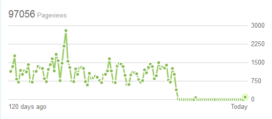
Pageviews Statistics from TypePad
The change in the number of website visitors is more difficult to compare, as the source of this number is different before (TP statistics) and after the switch (our AW Stats). They are worth a mention nevertheless, but you should take them with a grain of salt, they might not be 100 per cent accurate. As the graph from the TypePad dashboard shows, up until 12 December 2012, the average number of pageviews of the old US Soccer Players website was approximately 1300 per day. According to data from our server AW Stats, the average ‘Number of Visits’ after the move increased to circa 2750 per day.

Number of Visits according to AW Stats
US Soccer Players were “completely satisfied” says Hutcherson. They were good clients too, Vlado admitted. They knew what they wanted, always responded quickly, and understood that it is not an easy job to transform a website. Due to mutual satisfaction, the cooperation did not end with the new USsoccerplayers.com ‘going live’.
US Soccer Players decided to use Foliovision’s hosting services. Every client is offered this possibility, but USNSTPA has already taken care of this issue before contacting Foliovision. Due to persistent problems with the hosting of their choice, US Soccer Players accepted the offer of our company, and since 15 January 2013, ussoccerplayers.com is hosted by Foliovision, enjoying faster load times and without the downtime. Foliovision’s motto ‘Making the Web Work for You’ therefore proved itself to be completely true in this case.

Alec Kinnear
Alec has been helping businesses succeed online since 2000. Alec is an SEM expert with a background in advertising, as a former Head of Television for Grey Moscow and Senior Television Producer for Bates, Saatchi and Saatchi Russia.


Interesting I have a football and sports clothing and trainers site I might move over.
Hi Isabella,
We’d love to help you with your move.
Your email address bounced unfortunately.