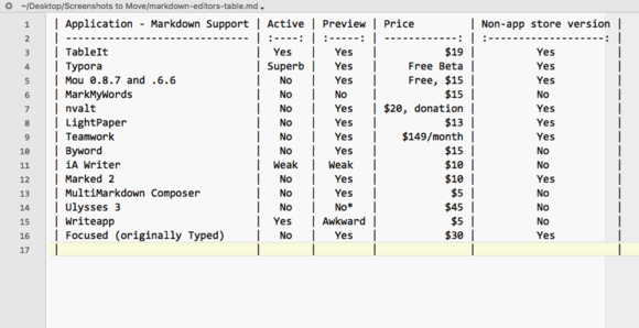
We use Markdown everywhere at Foliovision as our main project management software Teamwork offers excellent Markdown support. For some of our internal documents we desperately need tables. This was preventing us from switching everything to Markdown. I’d heard there was decent support for tables in Markdown but trying to edit Markdown tables long hand was not fun at all. This is what Markdown tables look like as plain text:
| Application - Markdown Support | Active | Preview | Price | Non-app store version | Writing Experience | Footnotes | Strikethrough | | ------------------------------ | :----: | :-----: | --------: | :-------------------: | :----------------: | --------- | ------------- | | Typora | Superb | Yes | Free Beta | Yes | ++++ | Weak | Two Tildes | | TableIt | Yes | Yes | $19 | Yes | N/A | N/A | N/A | | Marked 2 | No | Yes | $10 | Yes | N/A | Yes | Yes, GFM | | BBEdit/TextWrangler | Yes | No | $50/free | Yes | ++ | No | No |So I went looking for a Markdown editor which supported tables well for my team. In the process I discovered a lot about Markdown and even editing. I invite you to join me on my journey. As I use OS X and most of our team does as well (we have some Linux and a few Windows users: we have fewer people using Windows than Linux at this point), this article focuses on OS X Markdown editors. Our overall winner is a cross-platform application (OS X , Windows, Linux) built on HTML5 technology and we do cover other Windows Markdown editors at the end of the article.
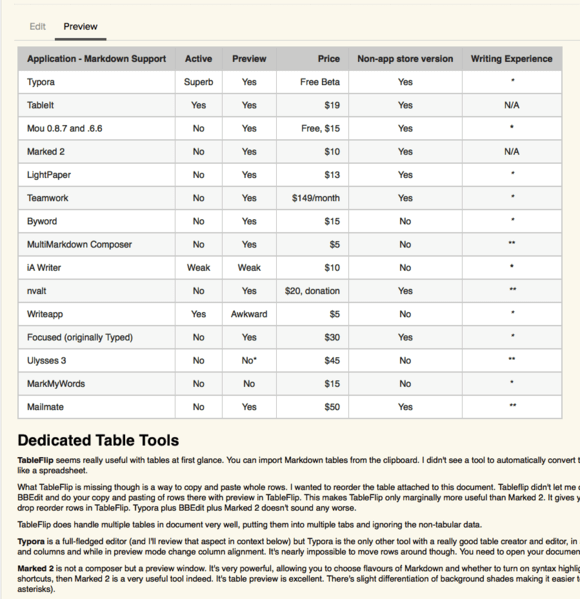
First let’s start with some tables. There are two tables in this article (originally I had one). The first table are dedicated table tools or preview applications. The second table is a list of Markdown applications ranked in my order of preference as a writing tool. If I didn’t have to publish to web or email regularly (priority on HTML preview) my rankings would probably change with some of the single pane Markdown editors doing better. Typora is the only application which appears on both lists. This is because Typora is both a great table creator/manager (won that category) and a first rate single pane editor (won that subcategory).
Markdown Table Tools
| Application | Table Creation | Table Preview | Price | Non-app store version | Writing Experience | Footnotes | Strikethrough |
|---|---|---|---|---|---|---|---|
| Typora | Superb | Yes | Free Beta | Yes | ++++ | Weak | Two Tildes |
| TableFlip | Yes | Yes | $19 | Yes | N/A | N/A | N/A |
| Marked 2 | No | Yes | $10 | Yes | N/A | Yes | Yes, GFM |
| BBEdit/TextWrangler | Yes | No | $50/free | Yes | ++ | No | No |
Dedicated Table Tools
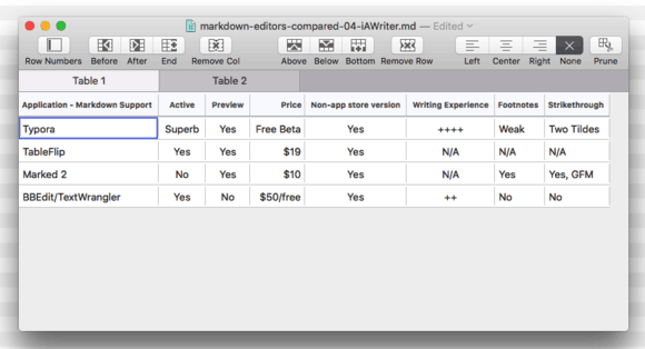
TableFlip seems useful with tables at first glance. You can import Markdown tables from the clipboard. I didn’t see a tool to automatically convert the table to HTML. The auto growing columns is fantastic. It’s possible to work on a really wide table in TableFlip like a spreadsheet.

TableFlip-sample-table
What TableFlip is missing though is a way to copy and paste whole rows. I wanted to reorder the table attached to this document. Tableflip didn’t let me do it: you can only copy one cell at a time. To do what I want to do you have to open your table in a text editor like BBEdit and do your copy and pasting of rows there with preview in TableFlip. This makes TableFlip only marginally more useful than Marked 2. It gives you awkward access to two sets of tools. TableFlip does not allow you to move columns either. I hope you designed your table right the first time, as BBEdit can’t help you move columns either. I would specifically like to swap the Strikeout and Footnotes columns and have no way to do so.
At the current price point of $19 I’d expect to at least be able to drag and drop reorder rows in TableFlip. Typora plus BBEdit plus Marked 2 doesn’t sound any worse.
TableFlip does handle multiple tables in document very well, putting them into multiple tabs and ignoring the non-tabular data.
Typora is a full-fledged editor (and I’ll review that aspect in context below) but Typora is the only other tool with a really good table creator and editor, in some ways better than even TableFlip. Certainly, the Typora table editor is prettier. At all times, you can add rows and columns and while in preview mode change column alignment. It’s nearly impossible to move rows around though. You need to open your document in BBEdit, TextWrangler or some other code editor to effectively move rows.

Typora in table editing mode
Marked 2 is not a composer but a preview window. It’s very powerful, allowing you to choose flavours of Markdown and whether to turn on syntax highlighting or not. If you have a beloved code editor (bbEdit, TextMate, vim, SublimeText) with all your keyboard shortcuts, then Marked 2 is a very useful tool indeed. It’s table preview is excellent. There’s slight differentiation of background shades making it easier to read.

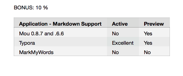
Simple table previewed in Marked2
Unfortunately Marked 2 fails on complex tables with Markdown syntax inside (even simple asterisks). So does Typora though under some circumstances (five asterisks). TableFlip, LightPaper and Mou are resilient enough to stand even the asterisk torture test, differentiating between a table cell and normal text area. I finally gave up and used plus signs instead, even though they are harder to read.

Marked 2 can be confused by nested Markdown signs within table cells
BBEdit/TextWrangler both come from BareBones a venerable Mac publisher. I own and use BBEdit myself. For just Markdown tables use, there’s zero reason to buy the full BBEdit (which is a wonderful development tool with great HTML preview tools). BBEdit’s Markdown preview is very weak (a late, half-hearted addition). Effectively the two apps are interchangeable as Markdown table row editor.

Clean preview in BBEdit lets you just copy and paste Markdown table lines, even long ones

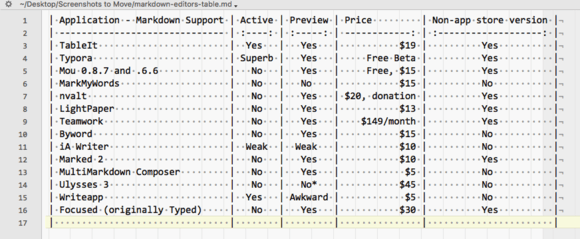
To see the nitty-gritty, just turn on invisibles in BBEdit
Markdown Writing Tools
In this next table dedicated to editors, dual pane editors come first and then single pane editors. Within the groups, applications are listed in order of the quality of writing experience. There is additional scoring for strikethrough and footnotes. The higher a tool is on this list, except for the first three, the more I like it. I might just make two tables instead.
Markdown Editors Rated for Table Support and Writing Experience
| Application | Table Creation | Table Preview | Price | Non-app store version | Writing Experience | Footnotes | Strikethrough |
|---|---|---|---|---|---|---|---|
| iA Writer | Weak | Yes | $10 | No | +++++ | Yes | Two Tildes |
| MacDown | No | Yes | Free | Yes | +++++ | Yes | Two Tildes |
| Mou 0.8.7 and .6.6 (Snow Leopard) | No | Yes | Free, $15 | Yes | +++++ | Yes | Two Tildes |
| LightPaper | No | Yes | $13 | Yes | ++++ | Yes | Two Tildes |
| Mailmate | No | Yes | $50 | Yes | ++++ | Yes | No |
| Typora | Superb | Yes | Free Beta | Yes | ++++ | No | Two Tildes |
| Teamwork | No | Yes | $149/month | Yes | +++ | No | Two Tildes |
| nvalt | No | Yes | Free, $20 | Yes | ++++ | Yes | No |
| Writeapp | Weak | Yes | $5 | No | +++ | Yes | No |
| Byword | No | Yes | $15 | No | +++ | Yes | No |
| TextNut | No | No | $25 | No | +++ | Non-standard | Yes |
| Caret | No | Yes | $12 | No | +++ | Weak | Yes |
| MultiMarkdown Composer | No | Yes | $5 | No | ++ | Yes, non-standard | No |
| Ulysses 3 | No | No | $45 | No | ++ | Non-standard | Pipes, no preview |
| Focused (originally Typed) | No | Yes | $30 | Yes | +++ | No | No |
| MarkMyWords | No | No | $15 | No | + | No | No |
Dual Panel Editors (Markdown + Preview)
Mou doesn’t have a wizard to add tables but does a great job letting you preview tables. Even editing a simple table is not particularly difficult in Mou. Complex tables are quite hopeless though.

Mou is great to work with Markdown tables until you get to really wide ones
iA Writer only lets you add tables, not edit or add to them, unlike Typora. The table preview is hard to read in its default setup (no column demarkers). Curiously enough iA Writer was one of my favorite Markdown editors until this exercise as you can have a huge composing interface with a small preview. The sync scroll is the best as well. The dark theme is delicious and easy to get to. What I really like is that it’s possible to have different widths of writing and preview columns and that text adjusts size automatically as you move the column delimiter. This means I can enjoy a large composing typeface than the one in which I preview. 1

Out of the box table preview is terrible in iA Writer.
Download and change preview theme for improvement
I ran into some other limitations with iA Writer while writing this article. Typora, Byword and Mou do a much better job of handling nested quotations than for example iA Writer (my main writing tool). This oversight and better table preview might make the indefatigable Mou my main writing tool again. Discovery: By changing the template to iA Writer’s free downloadable GitHub preview, both tables look much better as do nested quotations. It’s strange that iA writer ships with a not very capable default preview theme.
MarkMyWords is a powerful but ghastly ugly relic (just check out the icon) of another era of software development. Why you might like it? Why I liked it at one time: Textile support and Textile conversion. We used to use Basecamp Classic and Textile was a second mother tongue to me. We also had some older longer posts to convert. Later we built Pandoc Online for better conversion of Textile to Markdown and Markdown to HTML and back.

MarkMyWords suffers from strange and awkward aesthetics. If you’d like to work in other
markup languages than Markdown, MarkMyWords offers the widest choice.
Mailmate is a fantastic power user’s email client which wraps the best characteristics of Eudora and Apple Mail of Snow Leopard vintage in a single geeky package. The writing markup language of Mailmate is either Markdown (plaintext is also available of course). Markdown table preview is surprisingly capable. If you are a mailcentric person who uses Markdown you owe it to yourself to give Mailmate a chance. I just wish it was a little less expensive. I picked it up on a sale. Even at full price though Mailmate is worth it. Benny goes years between charging for updates.

MailMate offers full Markdown table support, with footnotes as well.
nvAlt is actually notetaking software from the author of Marked 2, Brett Terpsta. While I wouldn’t compose long Markdown documents in nvAlt as a first choice, it’s great to have a notetaking application which can handle Markdown with preview. While nvAlt can handle basic tables, it fails on sophisticated tables in the same way as Marked 2.

Normally one would not use nvAlt in full screen with large preview.
nvAlt is capable if called upon.
LightPaper is very similar to Mou for pay. LightPaper separates the writing and preview windows forcing a lot more window management on the writer. LightPaper does handle tables well (there’s no table generator built-in but it will send you to one).

LightPaper has excellent table preview with horizontal scrolling on wide table.
No built in table tools though.
Caret is 122.7 MB while Mou is 7.4 MB and iA Writer is 19.7 MB and even Ulysses is 34.5 MB. Very inefficient. Footnotes can’t have paragraphs or blockquotes. Single document only. It’s a pity as their website is beautiful. Relatively high CPU usage when in use with slow drop. It’s difficult to recommend Caret in comparison to the competition.
Single Panel Editors
Typora, Writeapp, Byword and Focused all belong to a category where you have to press a keyboard shortcut to preview your Markdown. When in preview mode, you cannot edit your text at all. Typora manages to break out of that awkward paradigm by allowing you to edit when in preview mode. The writer is encouraged to write all the time in preview mode, only switching to Markdown code view in the case of difficult formatting. I still prefer to write in code view with a preview handy. Seeing one’s writing in two typefaces with the markup code always visible lets you proof your copy as you write. Toggling preview on and off which is a very slow way to work if you have a lot of links and formatting (you can’t check anything until you finish the document.

Typora preview is beautiful but flipping back and forth to source mode is not efficient
Workflow in all of these single panel apps could be improved by moving the preview functionality to a non-modifier driven (let alone the painful dual modifier driven Option-Command-P required by Byword and Writeapp and Focused) such as F1. You can do this yourself using System Preferences > Keyboard > Shortcuts > App Shortcuts or the excellent OS X macro program Keyboard Maestro but the authors of these programs should have thought of this themselves (if any of them are reading, just add a preference: “Also use F1 to toggle preview”).2
Writeapp does have preview window option, but its preview jumps all over the place with tables in the preview. Generally the preview window shudders when typing which would make it impossible to use over the long haul. This would be a bug easily enough overcome but apparently Write is no longer in development. A pity as Writeapp publishes to Tumblr and WordPress out of the box. It also enjoys the most elegant default theme (you can only have one but it’s easy to customise). Due to the broken preview, Writeapp is evaluated as a single pane editor.

Writeapp very pretty preview shudders while typing. Unusable.
The Typora writing experience is way ahead of Writeapp or Byword though. What’s special about Byword is its ability to publish directly to WordPress, Medium, Tumblr, Blogger and Evernote. Byword on the other hand can’t copy a text selection to HTML. It’s all or nothing. Byword is also low contrast with no way to change that. Low contrast applications are the bane of modern design.

Fast track publishing to multiple platforms is a great feature.
Focused is another really pricey alternative at $30/license. It seems to be an overpriced version of Ommwriter with Markdown. Focused only offers single pane view w/toggle to Markdown. Awkward (far more so than Typora). Weird hideous icon. Strange product. Apparently it used to belong to RealMac software (makers of RapidWeaver) who have a history of creating and disposing of applications. Caveat Emptor. While Focused gets writing experience marks thanks to its music themes, it falls further in ratings due to its lack of support for both footnotes and strikethrough.

Focused in text mode. Nothing special.
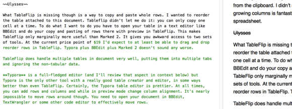
Ulysses strangely as the most expensive of these applications at $62 CAN cannot compose or preview tables (well unless you create them in HTML and wrap them in HTML blocks and then export as HTML – your tables won’t even show up in a PDF version!)
And here is an example of a Raw Source block, which inserts a table when exported as HTML (and just vanishes when exported as PDF):

Ulysses doesn’t offer preview but coloured markup.
Ulysses also hides your documents in its own custom folder and forces you to use iCloud more or less. The preview syntax and colouring for me is just weird.

Colours, colours everywhere.
Far from being a writer’s instrument, it seems like an aesthetic torture chamber. Instead of just allowing you to write and preview your document everything is colour coded. In Ulysses favour are complex and useful typewriter and focus modes which emulate the concentration of working on a typewriter.
- Highlight fades out everything but the current line, sentence or paragraph, respectively.
- Fixed Scrolling (also known as typewriter scrolling) keeps the line you’re currently typing in vertically fixed on your screen. It is available in several variants.
- Mark Current Line highlights the line you’re currently typing in.

Ulysses typewriter mode is well thought out
The built-in help and walkthrough is impressive. It really shows you that difficult to use software can be made easier to adopt, via post-sales training and selling within the application. The Ulyssses weblog with real writers’ stories is also impressive.
There is no way Ulysses offers value for $60 in comparison to the other tools we’ve seen here from free to $20. Ulysses would be my least favourite day to day editor. On top that Ulysses is the least capable advanced Markdown editor. It only clear strength seems to be better templating options for PDF output (HTML output’s final appearance is dependent on your website stylesheet not that of Ulysses).
Teamwork is our main project management software which we use every day in Foliovision. There’s Markdown support in Messages, Comments and Notebooks. Here I’m referring to the Notebook support. It’s not dual screen but there’s a built-in preview tab which makes it easy to proof your work. Teamwork did not break the table but the rating asterisks were heavily edited from a five star system to a two star system. This is the same indicator which broke Marked 2 and nvAlt so if I put in numeric ratings the table support would be flawless. Does not support footnotes at all though. I’ll encourage Teamwork to add footnote support.

Teamwork Markdown support and preview is excellent, allowing a single working environment
For an application which supports Markdown reluctantly (I was one of the clients pushing Teamwork for across the board Markdown support), Teamwork does awfully well in providing a useable and resilient Markdown environment. Having the same markup language across all our projects improves our company workflow enormously.
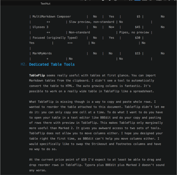
TextNut suffers from the same weird library nonsense which Ulysses has. It’s very difficult to even get a file into Marked 2 for preview. The icon is annoying. Very powerful focus, typewriter and zen options for writers who appreciate that sort of thing (right now I’m typing happily away in iA Writer and very happy to be able to see the full text of my page. I’d kind of like to have a horizontal cursor to emulate the old terminal mode more but I can live without that: when editing a vertical cursor is better in any case). The visual markup like Ulysses is both colourful and distracting (H4 headers are marked at both H4 and with four hashtags, as opposed to iA Writer where you get just four hashtags aligned right in the left hand margin allowing a writer to read straight down the page).

TextNut’s preview mode cannot handle tables at all
Unique is a medium style formatting bar which pops up whenever you select text and gives you mouse access to the basic and the more complex Markdown styling options. While the formatting bar looks great, With your primary writing tool you should be using keyboard shortcuts so it’s a bit of a distraction. Unique and cool is a formatting clear option in the menu.

TextNut’s somewhat unique formatting bar, something like Medium
The rich text mode looks much clearer and includes most of the same shortcuts. Footnotes get moved to the bottom when you switch between Markdown and rich text mode which is okay, except…unlike all the other applications which support footnotes, when copying footnotes into HTML TextNut creates divs instead of a numbered list. Varying the HTML code brings formatting and compatibility worries when pasting to a website. TextNut is just too hard to use unless a writer really wants libraries and pop-up formatting. I still don’t understand the benefits of the RTF writing environment with two document formats. Sync and conversion is difficult: it would be much better to pick a master format and stick to it. Creating alternative formats on export makes a lot more sense to me. That’s the way Typora does it. Typora’s preview mode looks a lot like TextNut’s RTF mode and there’s no format conversion between them.
Extra Features
This is an explanation of each additional column in my ratings table above.
App Store
I don’t like app store apps much. The app store is subject to state spyware (if Apple is asked to embed code in an app, by US law Apple must do so). Your apps could just stop working. I much prefer direct purchase from the vendor. Unfortunately in the Markdown space, many apps are only available in the app store. Out of the Markdown editors which I care about, only iA Writer is app store only so there are lots of non-app store options.
Footnotes
I don’t use official Markdown footnotes when writing ( Thanks to this review I now do use regular Markdown footnotes and know which apps support them. For my reference and yours, support for footnotes is included in the table. Our overall winner in the table sweepstakes, Typora, has very poor footnote support ironically.[^2]for example), instead creating footnotes by hand with round brackets and writing them at the bottom. Ideally I’d like to be able to use Markdown footnotes usefully at some point.
One of the best footnote implementations comes in MacDown (a clone of Mou in active development) who take the time to document how to use Markdown footnotes well.3 On the other hand, MacDown can’t handle a simple dollar sign within text without turning the following text green.

MacDown does well on footnotes but a simple dollar sign breaks syntax
Typora’s footnote support is next to useless (basically Typora just renders superscript from the footnote syntax. It’s up to the author to number and position his footnotes himself. Typora stays on top of this ratings table thanks to its extraordinary table support but its failings with footnotes takes it out of the stakes as a serious daily Markdown writer unless you really like single pane with hot key preview. iA Writer enjoys superb footnote support.

IA Writer handles footnotes really well. You can create your footnotes within the article
and your footnotes then turn up at the bottom automatically.
Strikethrough
For me, strikethrough or strikeout is one of the more useful commmunication signals around. I often have an idea which I reshape to be better but I want my readers to know that I had the original idea and scratched it. Strikethrough is a bog standard HTML tag (<del></del>)so by rights should really be in Markdown. Curiously, the best of these editors offered a simple strikethrough syntax. Marked 2 does not offer strikethrough out of the box ([change parser to Discount/GFM](change parser to Discount/GFM) for it to preview properly. I will ask Benny at Mailmate to add two tilde strikethrough.
Workflow
Early on in this article, I planned to propose Typora, TextWrangler (or BBEdit) as the ideal workflow for creating and editing complex tables. One would use Typora to create the tables and BBEdit to handle complex editing operations. Typora plus BBEdit (be sure to turn off softwrap) will let you do almost anything you need with a Markdown table. If you have a really wide table the preview isn’t great (sometimes individual letters will flow over to the next row; Mou handles this better as does Marked 2 which could be added to this workflow for better preview of both tables and footnotes).
Typora is still the best Markdown editor to create and edit tables. Once your basic tables are done, whether you prefer to edit your document in Mou or Typora is a subjective question. I’d rather be working in a two pane editor like Mou, MacDown or iA Writer. In any case, complex table editing (moving rows) really must be done in BBEdit (or TextWrangler) with softwrap turned off. Add Marked 2 to main Typora workflow for better table and footnote preview. But that makes for a complex workflow (three applications: Typora, TextWrangler, Marked 2).
Cost: free to $25 (Typora is beta, Mou is $15 donationware, TextWrangler is free, Marked 2 is $10: I’ve donated to Mou)
Alternative Workflow
If you do a lot of work with tables and like to write in Markdown, TableFlip is an equally powerful table tools as Typora. Until you can drag and drop rows with TableFlip I wouldn’t consider it an essential tool as long as Typora is there to help you create tables and choose alignment for your columns. Complex table editing (moving rows) will still require a trip to BBEdit. A great dual pane editor like Mou or MacDown or iA Writer plus TableFlip and TextWrangler would be even more powerful than Typora plus TextWrangler/BBEdit.
Cost: $19 to $34 (TableFlip is $19; Mou is $15 donationware, MacDown is free, iA Writer is $10; TextWrangler is free).
Table Conversion to HTML
Curiously Mou is the only one of the applications supporting tables who use old style HTML alignment (<td align="center">) instead of style tags (<td style="text-align:center;">) for alignment. It makes for a much smaller and more readable table and even one which is easier to style subsequently (or clean). FYI, TableFlip cannot export tables as HTML on its own, it needs a helper to convert to Markdown table to HTML. As you’ll be writing in a helper anyway I don’t see this as a serious workflow issue.
If you ever want to convert HTML tables to Markdown tables for editing before moving them back to HTML tables for publishing, Dom Christie has published a fantastic online HTML tables to Markdown tables tool which worked well in my testing.4 Donat Studios has built an excellent CSV to Markdown Table converter which passed testing as well. Both scripts are on GitHub with an MIT license so feel free to incorporate or extend them in your own tools.
It’s so much easier to build footnotes within Markdown that this is a strong argument for a 100% Markdown workflow (we haven’t managed it for our articles in WordPress as we publish some demos which just don’t fit within Markdown.
Danger of both workflows: Overwriting, Losing Data
Be very careful with including TableFlip in your workflow saves your whole document as soon as you even click into any table cell and Mou or Typora will lose any changes made since its last save. Typora does not autosave. You must save manually before switching to TableFlip. BBEdit will usually warn you about unsaved changes when you move your focus to its version of the document if there are changes on the document on disk and to the BBEdit version.

BBEdit will warn you reliably

TableFlip’s warnings are a bit less reliable depending on the partner application
Just now Typora and TableFlip were in conflict over a file freezing both of them. After force-quitting TableFlip, Typora recovered and I was able to save the document normally (I’d copied source ahead of time just in case). As every writer knows even losing a single paragraph and reconstructing it, takes the flow out of writing and makes for longer, less productive days. Having endured conflicts with Typora and TableFlip all open losing some text, if I were to use a Typora to create tables while doing the main edit with another Markdown application I would edit the Markdown tables in a separate document in Typora and paste them back in just before publication.
Separate documents is a slower workflow so I’m planning to use iA Writer and TableFlip to build my own tables in the future. While I finished the article in iA Writer and TableFlip, I did write most of this article and edit most of the large table at the top in Typora. Both workflows are equally viable. iA Writer and TableFlip has the added advantage over Typora of allowing me to edit tables without losing my place in my main editor while writing.
Like TextWrangler/BBEdit, iA Writer co-operates well with TableFlip so it’s safe to use iA Writer and TableFlip together (iA Writer seems to autosave when moved to background focus) but I’m likely to press the save key before switching to TableFlip anyway out of caution. I still have to do some more testing with iA Writer plus TableFlip plus BBEdit to able to feel really comfortable. Unlike iAWriter, BBEdit does not autosave on changing applications so there’s a much bigger chance of making a change and ending up with two versions or lost text. It’s probably best to open your Markdown document in BBEdit when you need to move rows and otherwise work in just iA Writer and TableFlip.
As an integrated two application system keeps workflow simpler and faster, iA Writer (or MacDown) and TableFlip sounds like the ideal Markdown workflow for people who need tables. If you’d like to go free and don’t do much with footnotes, just Typora is a great second choice.
Markdown tools not covered
Recommended OS X Markdown extras
- If you are using Markdown a lot, make sure to go by QLmarkdown to grab a QuickLook plugin for Markdown. Working in El Capitan. Just drop it into
/Users/~/Library/QuickLook. Create the folder if you have to. To get to your user library quickly, hold down Option and choose Go > Library in the Finder to reveal the user’s hidden Library. Alternatively you can move it into the main system library (for all users) but you’ll have to use the terminal in that case (permissions). Works great. Tables usually work (not always). Images are broken even with correct paths in El Capitan due to QuickLook sandboxing. You can change text size by editing the styles.css file inside/Users/~/Library/QuickLook/QLMarkdown.qlgenerator/Contents/Resources/styles.css - Clarify 2 lesson builder. Exports to Markdown: export is clean and logical but non-configurable (you could add a script). Excellent tool for quickly creating documentation. Markdown editors don’t handle images all that well. Clarify does. $30 ($15 upgrade). Clarify 1 does not have export to Markdown. Not interesting. It is possible to customise the Markdown export via XML.
- iThoughts X is mindmap software with Markdown text editing (including via copy and paste from other apps). Markdown here is surprisingly useful in mindmapping software. iThoughts X is very powerful but not as attractive as MindNode Pro. Powerful but at a price. $50.
- FoldingText. Another outliner style Markdown editor. Hog Bay Software builds and ends of lines products. I bought WriteRoom, Hog Bay Notebook, TaskPaper. Maybe even Mori. The notebook became Mori, a kind of vaporware. FoldingText looks like what Hog Bay Notebook should have become. Be forewarned: if you like the software the way it is buy it. Jesse Gros Jean does not have a long attention span and changes file library structure and formats (fortunately with Markdown it’s more difficult). No preview but works well with Marked 2 $30. More info.
NoN-recommended OS X applications
- Erato. Not for sale while v2 is being developed. Now that’s a weird and not very good position. Nice icon though.
- Whiskey. Only made it to Beta. There’s some videos.
- Highlights App. Workflow is a bit complicated but basically allows you to extra all your highlights from a PDF into a single Markdown document. It might almost be easier to copy the highlights as you go unless you are reading on an iPad. Complex and fiddly. If you need it, you know who you are. $30
- Hemingway Editor. For the illiterate (and non-native speakers) who can’t build correct sentences. $20
- Texts.io. An interesting idea and a very elegant toolbar fall down on rather poor Markdown conversion coming and going via copy and paste. Nominally great table support is useless as the tables are mangled on import and export. Very peculiarly comes with hard wrapping on save enabled by default. The problem is not the price but the execution. $19
- Markdown Pro. Single page website full of hype. Talking about how great Mavericks is. Support only via email (no docs). Out of date software with a price tag, app store only, no thanks. $10
- Touch Dream App’s Markdown. Doesn’t open on latest OS, won’t save in .md format, Developer’s site is Wix subdomain. Fourth most popular product in the app store on search for “Markdown”. How is it that Apple allowed this punk to run off with John Gruber’s trademark name for an app which just makes people angry and hate Markup. $9 for something worse than almost anything on this list.
- MarkdownD. Another big toolbar version, but this time dual pane with preview. Using the buttons gets you multiple Markdown header levels, not changing the existing one. Is not and does not feel like native Mac app. The settings keyboard shortcut doesn’t work. Does handle tables well with full support for GitHub flavoured Markdown. Yes for Strikethrough, no for footnotes. Clumsy way to waste $16
- Writed. Does not bring anything special to the table. Can’t preview tables. The export packs for print and PDF are $3. But why buy this one? There are better Markdown editors for free. There’s a pro version which doesn’t seem to do anything more but is now $9 instead of $3 for an export pack.
- Gone: Writedown, but replaced by a Chinese $3 version which doesn’t seem to do anything special.
Windows Markdown editors with good table support
- Typora (free). Covered in detail above. Highly recommended.
- MarkdownPad 2 ($15) for version with table support. Free version does not offer any of the advanced features.
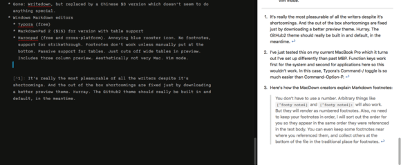
- Haroopad (free and cross-platform). Annoying blue rooster icon. No footnotes, support for strikethrough. Footnotes don’t work unless manually put at the bottom. Passive support for tables. Just cuts off wide tables in preview. Includes three column preview. Aesthetically not very Mac. Vim mode is a plus.
- Caret. Covered above. Cross-platform. Not recommended on OS X due to inefficient resource usage on. Perhaps the Windows version is better. The competition is less stiff.
-
It’s really the most pleasurable of all the writers despite it’s shortcomings. And the out of the box shortcomings are fixed just by downloading a better preview theme. The GitHub2 theme should really be built in and default, in the meantime. ↩︎
-
I’ve just tested this on my current MacBook Pro which it turns out I’ve set up differently than past MBP. Function keys work first for the system and second for applications here so this wouldn’t work. In this case, Typora’s Command-/ toggle is so much easier than Command-Option-P. ↩︎
-
Here’s how the MacDown creators explain Markdown footnotes:
You don’t have to use a number. Arbitrary things like
[^footy note4]and[^footy note4]:will also work. But they will render as numbered footnotes. Also, no need to keep your footnotes in order, I will sort out the order for you so they appear in the same order they were referenced in the text body. You can even keep some footnotes near where you referenced them, and collect others at the bottom of the file in the traditional place for footnotes. ↩︎ -
4. Neither Pandoc’s test install nor our own Pandoc online can do the job.↩︎

Alec Kinnear
Alec has been helping businesses succeed online since 2000. Alec is an SEM expert with a background in advertising, as a former Head of Television for Grey Moscow and Senior Television Producer for Bates, Saatchi and Saatchi Russia.








Visual Studio Code is free, has highlighting in the editor, and a preview possibility. I don’t know about the table stuff…
Excellent MD editor coverage, thank you!
Great article!
I’ve put together a simple Excel Visual Basic script to create a markdown table form an Excel selection. Use it all the time.
github.com/apfernandes/excelToMarkdown
Cheers, Pedro
@Lthrane As long as there are better behaved competitors out there no one should voluntarily be installing Microsoft software. Good to know though. I have heard good things about VSC as a coding tool.
@Demian Glad the article helped you. Now just to add Markdown comments to this weblog!
@Pedro That’s an awesome hack for Excel users (Excel is definitely the best piece of software Microsoft ever made). Thank you for sharing. I’d certainly like a script like that for OpenOffice or LibreOffice.
Sorry to be dense, but what does the “Active” heading refer to in each table?
I’m surprised that you missed Quiver in your excellent survey of Markdown editing apps. Its developers call it a Programmer’s Notebook that:
Hi Eric,
Active refers to Table Suport. Good point. Originally the table had the header: Markdown Table Support and not much else in the table. Then I added all the other feature and renamed the tables. I’ll have to fix this. Thanks for asking.
Hi Stuart,
Thanks for point out Quiver. I also missed Bear out of the really good apps. Another round of Markdown editors. I’m ready. In my spare time, I’m working on the next generation WordPress editor. Editors make the world go round and are much sexier than automobiles. At least I think so.
Nice write-up.
Just as a heads-up with Typora – the footnotes are a little less dire than you think.
If you hover over an empty footnote, it’ll pop-out and complain about the syntax… BUT if you click the link, it’ll create the footnote section at the end of the document for you and scroll you down (I’m using Windows; it might be different in macOS).
Hardly fantastic, and not very discoverable, but it is a thing.
As a regular user of MarkMyWords I have to say you underscored the app a little in my opinion. It’s true, the language-option Markdown doesn’t offer anything else than the original Markdown-specification. But you can use the MultiMarkdown-option to get table-support, they display just fine.
There’s also a plugin (CSV2MMDTable) on the developers-site, I use often. It’s quite simple to use, comma separate your fields, select the text, use the plugin and your table is ready. Example:
Row1 Cell1, Row1 Cell2
Row2 Cell1, Row2 Cell2
The strike-tag is kind of supported by MarkMyWords for all languages, there’s even a keyboard-shortcut (CMD+D), it produces in Markdown and MultiMarkdown the strike-HTML-tag.
Regarding footnotes, I can’t say much to them since I never use them, but I got curious and tried a text from John Gruber with a footnote and this one was correctly displayed. Or do you mean some kind of automatic tools to order footnotes? You could add a snippet or make a plugin to to add some automatic creation, the vast extensibility is the greatest strength of MarkMyWords in my opinion.
Regarding your scores for writing experience, there should be a better explanation what you exactly mean. Seriously, such low scores for Ulysses, MultiMarkdown Composer and MarkMyWords?
Two more apps for your list: [Alec: sorry these apps don’t pass quality/unique standards]
2 more things, by the look of the screenshot of MarkMyWords, you seem to use an older version, I’m using 1.9.1 and you placed the preference pane of MarkMyWords in the Ulysses-section.
I architected and designed computer systems for many years, primarily using Verilog. A good text editor was a must. I learned over the years to use Vim. Vim can do anything, although many people find the learning curve steep. My experience is that it is worth it.
I was struck by your comments regarding the visual appearance of tables in editors, and your difficulties in moving columns around. Vim solves both problems quite easily.
I used Vim extensively for documentation, including generating ascii based drawings and timing diagrams. My documentation was done using Markdown (actually MultiMarkdown). There are good, easily accessible and free versions for MacOS (I use MacVim), Windows, and Linux, as well as for other OS’s.
I typed in my tables, separated by ‘|’ and didn’t worry about spacing. Of course, it looked like a confusing mess. At any point, when I wanted it to look nice in the editor, making use of two Vim plugins call Align and AlignMaps, I selected the lines in the table and typed the command “:Align |”. This aligned all the columns perfectly, spaces added where necessary.
To move columns, I simply select (using Vim’s columnar select mode), the column I want to move. I cut it, place my cursor in the proper position where I want the column to go, and paste. Done. Size didn’t matter–I routinely did this on tables that were thousands of lines long.
I have found, on my Mac, that using Vim as a markdown editor and Marked 2 as a previewer, that life is really good.
As someone who uses Ulysses on a daily basis I must point out that including it in a table-centric review is unfair due to the app’s intended use, and that there are certain flaws in your review:
The current version does in fact support options for iCloud storage, local storage, or working with external folders, and does support live formatted previews just like all other tools.
When it comes to tables, it is not entirely unsurprising that Ulysses does not support them. The tool is targeted at writers: people who write fulltext, not tables. It is far more convenient for writers (of the non-technical kind) to place tables (on the rare occasion that they require them) via images or even HTML, than having to fiddle with unsightly markdown-based tables which are, as the need for the above review illustrates, not that userfriendly. Image handling on the other hand is far more convenient in Ulysses than in many other applications, as it is truly drag and drop.
Concerning the storage system of Ulysses: the environment is meant for authoring larger works, not single text files. As these larger works can consist of multiple linked, combined, or even dynamically combined files, it makes sense to let the app handle the storage.
Ulysses also provides a much wider array of export options including: HTML, PDF, ePub, and MS Word, which again illustrates the fact that it is meant for authoring fulltexts, not tables.
Hi Nice Folk,
You’re right – I was using MarkMyWords 1.5.1 instead of 1.9.1. I’ve installed the latest version now and find the fundamental aesthetic and workflow issues I highlighted remain. Still there does seem to be a plugin architecture as you suggested. Based on your in-depth knowledge of Xelaton products, I wonder if you are not Alexander Sasse yourself. If so, thank you for your pioneering efforts to create an advanced Markdown editor for OS X, Alexander. To compete, you’ll have to change graphics and streamline both interface and preferences. While powerful, the interface is just too fiddly for now.
PS. Thanks for checking my illustrations carefully. I’ve added the correct illustration for Ulysses preferences.
Hi Terry,
Thanks for describing your workflow. While it’s perfect for a programmer who is using Markdown as an editing language for technical documentation, it’s very cerebral. While I don’t understand people who want to have a single pane editor and work with visual RTF when they are writing Markdown, going so far towards just plain text editing loses the advantage of modern software. Mou, Macdown and iaWriter all seem to offer the best of both worlds: plain text with a modicum of visual formatting plus preview.
I’m sure some people would find your workflow better as there are still fewer barriers between you and the raw formatting of Markdown. Like you, I find Marked 2 very handy when I’m working on some markdown in BBEdit for instance or even nvAlt (the built-in preview is no great shakes).
Hi John,
While Ulysses does have its fans, it remains too expensive for its capabilities. A cool name and lots of marketing do not add $50 value to the product. The idea of hiding my almost plain text Markdown in a proprietary database is horrifying. And that I should pay for the privilege of not having direct access to my work in a format in which I can manage it?
Other Markdown applications handle tables well. I see no reason to make excuses for Ulysses.
The weird colour coded syntax might have some appeal at another price point. Ulysses for me is the Markdown incarnation of the fable of the Emperor’s New Clothes:
iaWriter manages to offer a database version and within the same version allow people not to use a database at all (my case).
Hi Alec,
Thanks for your very thorough piece. Creating and editing tables wasn’t a must-have feature for me in my markdown editor although I have had times when I would appreciate the convenience of being able to do them and preview them.
I agree about your point of “stop making excuses for Ulysses”. I’ve been looking for a useful and sensibly priced alternative to Ulysses for a number of months but wasn’t overly motivated until Soulman changed their pricing model to Subscription. Quite a number of longterm user requests were being ignored, and better table support WAS one of them. I had used Ulysses for years, quite a long time and through three major version upgrades to find the software losing it’s way and becoming more and more a Peacock as against a Carrier Pigeon.
iA Writer has got better with tables this year, after you originally wrote this article, not that I’m suggesting you raise your assessment of it particularly but it may be worth noting they’ve been willing to make improvements continually responding to their user base’s requests.
One of the best editor reviews (Markdown or otherwise) I’ve encountered. Excellent work and immediately helpful. Bravo!
You’re missing Sublime + table editor == table magic in markdown
Nice tip, Piotr, especially for Sublime users.
I’m a 15 year BBEdit user myself so I’m personally more interested in dedicated Markdown tools than enhancements to anything except BBEdit. But for Sublime users, fantastic.